
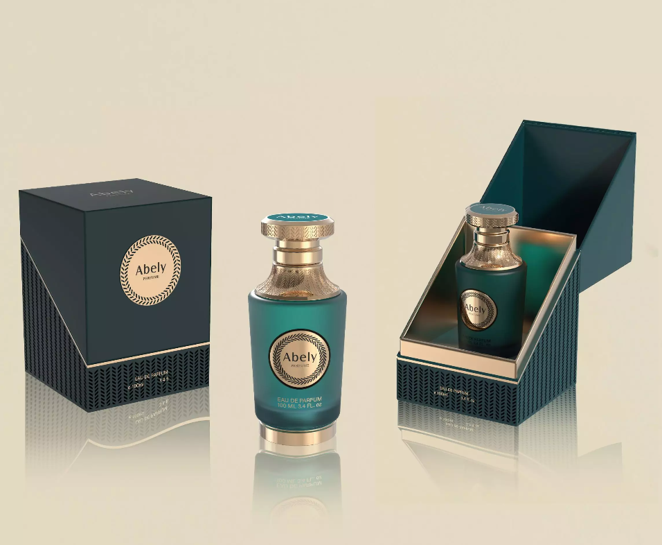
Opening — why this matters to you
Look, when you’re building a scent brand, people don’t just buy the smell — they buy the whole moment. This piece is all about designing perfume bottles unique enough to grab attention, simple enough to feel right in the hand, and smart enough to sell repeat. I’m writing from a user-first angle: what customers notice, what bugs them, and how small choices change perception. For a quick peek at visual finishes that pop on-shelf, check out perfume bottles unique.
Why user-centric packaging actually converts
Users judge a brand inside three seconds. That’s not hype — it’s human heuristics. People infer quality from weight, texture, and the way light hits glass. Brands that get those first impressions right reduce friction and make shoppers feel smart about buying. The design cues line up with solid product-design thinking — think Apple’s obsession with material and interaction — and they translate straight to fragrance bottle design decisions.
Core design decisions customers care about
Don’t overthink — focus. Here’s what consistently moves the needle:
– Weight & balance: a slightly heavy base feels premium.
– Neck & spray action: smooth spray = perceived value.
– Finish: matte vs glossy vs holographic tells different stories — see how holographic finishes catch eyes.
– Shape language: ergonomic curves or striking geometric silhouettes communicate personality fast.
– Labeling & typography: legible, confident type beats ornate clutter every time.
Common mistakes brands keep making — and how to dodge ‘em
Too many brands chase gimmicks or copy a high-end look without nailing fundamentals. Cheap closures, off-center sprays, and fragile caps kill trust. Another big one is over-branding — slapping too many logos or busy patterns that confuse the user. Keep it focused. Test prototypes with real hands — not just photos. — People hold stuff different than you think.
Alternatives & trade-offs: quick guide
Every choice has a trade-off. Pick the lane that matches your brand goal:
– Budget launch: acetate labels, simple mold, recyclable cap — keeps cost tight and still looks clean.
– Premium boutique: heavier glass, bespoke metal cap, custom embossing — costs go up but shelf impact and perceived value increase significantly.
– Eco-forward: post-consumer recycled glass, refillable mechanism, minimal packaging — appeals to conscious buyers but needs clear messaging.
How to evaluate manufacturers (so you don’t get burned)
Ask for real samples — not just glossy renders. Verify tolerances on spray performance, cap fit, and finish consistency. Request a small run with production tooling to spot variations. Use standard tests: drop, spray count, cap torque. If your manufacturer walks you through these checks, they’re serious about quality.
Quick case vibe: where Abely fits in
Abely pairs user-focused design with manufacturing chops — they offer finishes that read premium without overblown cost, and they prototype fast so you can test in the wild. That bridge between aesthetic and practical production is what turns curious browsers into buyers. When the bottle feels right, the scent sells itself.
Advisory — three golden evaluation metrics
When you’re choosing a strategy or a partner, use these three metrics:
1) Perceived weight-to-cost ratio — does the bottle feel pricier than it costs to make?
2) Functional durability score — how many sprays, drops, and cap cycles can it survive without failing?
3) Shelf standout rate — in a blind test, how many users notice your bottle first vs competitors?
Designing great bottles means marrying feel, function, and story — and that’s exactly where Abely adds value. Final thought: trust the user, prototype early, and pick partners who test like pros.
Expertise sealed — make it feel unforgettable.
– always iterate.